About Zoci
Zoci is a Mumbai-based jewelry brand offering contemporary collections designed for everyday elegance and meaningful occasions. Its catalog includes necklaces, earrings, pendants, bracelets, rings, and curated jewelry sets that appeal to customers looking for timeless yet wearable designs.
Unlike mass-market jewelry retailers, Zoci positions itself around refinement, simplicity, and thoughtful craftsmanship. Its products are designed to be gifted, collected, and worn regularly, making the online shopping experience just as important as the products themselves.
Before engaging us, the brand had already selected Shopify as its commerce platform and adopted the Milano theme as its starting point. While the technical foundation was in place, the storefront required significant customization to better align with the brand's premium positioning. Our objective was to bridge the gap between a standard Shopify implementation and a luxury shopping experience that customers would immediately associate with quality and trust.
Project Overview
Every eCommerce project begins with a simple question:
What experience should customers have when they visit the store?
For Zoci, the answer wasn't simply "buy jewelry."
The objective was to create an environment where visitors could comfortably browse collections, appreciate product craftsmanship, discover complementary pieces, and confidently complete purchases without feeling overwhelmed.
Instead of treating the website as a product catalog, we approached it as a branded shopping experience.
Our role extended well beyond theme customization. We worked across design implementation, product organization, content structuring, navigation planning, merchandising, data management, image preparation, mobile responsiveness, and payment integration to create a cohesive customer journey.
Project Snapshot
| Category | Details |
|---|
| Platform | Shopify |
| Theme | Milano (Customized) |
| Duration | 1 Month |
| Team | 2 Developers |
| Products Uploaded | 540 |
| SKUs Managed | 540 |
| Collections | 5 |
| Store Pages | 8 |
| Product Images Managed | 1,620 |
| Marketing Images Generated | 1,080 |
| Images Optimized | 100 |
| Product Data Cleaned | 100% |
| Product Categorization | 100% |
| Payment Integration | Razorpay |
| Language | English |
| Currency | Indian Rupee (INR) |
The Challenge
Building Trust Before Selling Products
Jewelry occupies a unique position in eCommerce.
Customers are not simply purchasing an item, they are investing in gifts, celebrations, milestones, and personal memories. Every product carries emotional significance, which means every page of the website must reinforce confidence before asking visitors to make a purchase.
Although the Milano theme provided a functional framework, the existing storefront lacked the emotional depth expected from a premium jewelry brand. Several areas required refinement to better support customer discovery, merchandising, and storytelling.
Creating a Distinct Brand Identity
One of the biggest challenges was differentiation.
Many Shopify stores built on premium themes end up looking remarkably similar because they rely heavily on default layouts and components.
For Zoci, standing out required more than visual adjustments.
The storefront needed to communicate elegance through typography, spacing, imagery, navigation, and content hierarchy while maintaining the simplicity that luxury shoppers expect.
Every design decision had to support the brand without introducing unnecessary complexity.
Organizing a Large Product Catalog
Managing 540 individual SKUs required a structured approach to product management.
Every product needed to:
- Be uploaded accurately
- Be categorized correctly
- Be assigned to the appropriate collection
- Be checked for consistency
- Be configured with clean product information
- Be supported by optimized imagery
In total, we worked with 1,620 product images while generating an additional 1,080 branded marketing visuals to support merchandising throughout the storefront.
Alongside this effort, we performed a complete data cleanup, ensuring naming conventions, descriptions, collections, and categorization remained consistent across the entire catalog.
The result was a significantly cleaner backend that simplified merchandising and future catalog management.
Improving Product Discovery
Luxury shoppers rarely purchase the first item they see.
They browse.
They compare.
They revisit products multiple times before making a decision.
The existing customer journey didn't fully support that behavior.
Visitors needed clearer navigation, stronger collection organization, more intentional merchandising, and better pathways between related products.
Instead of forcing shoppers through dense product grids, we focused on creating guided discovery through curated collections, featured products, promotional sections, and structured navigation that encouraged exploration rather than overwhelming customers.
Creating Confidence on Product Pages
For jewelry, uncertainty often prevents purchases.
Customers want answers to practical questions before they commit:
- Is this the right style?
- Will it pair well with other jewelry?
- Can I save it for later?
- Is it available now?
- Can I compare similar options?
Rather than relying solely on attractive photography, we redesigned the product experience to combine premium presentation with practical purchasing tools.
This meant improving media presentation, introducing better information hierarchy, incorporating wishlist and comparison functionality, surfacing related products, and making product pages feel reassuring rather than transactional.
The Solution
Our Approach
Instead of replacing the existing Shopify implementation, we focused on maximizing the strengths of the Milano theme through thoughtful customization.
Our strategy centered around four key principles:
Elevate the brand without overcomplicating the experience.
Luxury shoppers value simplicity.
Every design element had to reinforce elegance while remaining easy to navigate.
Structure the catalog for discovery.
With 540 products, information architecture became just as important as visual design.
Collections, navigation, and merchandising had to guide customers naturally through the catalog.
Strengthen product confidence.
Every product page needed to balance emotional appeal with practical information so visitors could move confidently toward purchase.
Build for long-term growth.
Rather than creating rigid templates, we developed a modular storefront capable of supporting future collections, campaigns, promotions, and seasonal merchandising without requiring significant redevelopment.
Results & Impact
The success of the Zoci project wasn't defined by introducing flashy features or rebuilding the platform from scratch. It was measured by delivering a complete, production-ready Shopify storefront that reflected the brand's premium positioning while providing a solid operational foundation for future growth.
Within a one-month timeline, our team transformed a standard Milano theme implementation into a polished jewelry storefront through strategic customization, structured product management, and thoughtful user experience improvements. Every page, product, and customer interaction was refined to create a shopping journey that felt elegant, intuitive, and commercially effective.
These deliverables established a scalable storefront that allows the client to continuously expand their catalog, launch seasonal collections, and manage merchandising without restructuring the entire website.
Business Outcomes
Rather than delivering isolated improvements, every enhancement contributed to a more cohesive shopping experience.
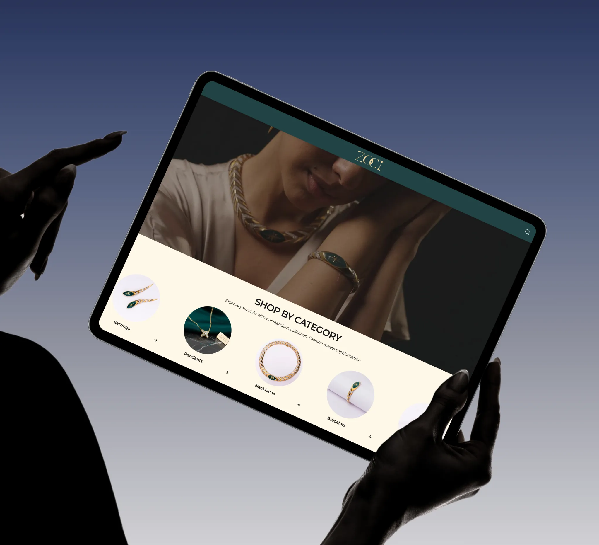
The reorganized collection structure made product discovery more intuitive, helping customers browse by category instead of navigating large product grids. Homepage merchandising created clear entry points into featured collections, trending products, and promotional campaigns, encouraging visitors to explore the catalog with confidence.
The product catalog itself became significantly easier to manage. With every product cleaned, categorized, and standardized, future inventory additions can follow a consistent structure instead of requiring repetitive manual corrections.
Managing 540 products and 540 individual SKUs also created a reliable operational foundation for merchandising, search, filtering, and collection management.
Improved Customer Experience
Luxury retail depends heavily on presentation.
Throughout the project, we focused on reducing hesitation while maintaining the premium feel expected from a jewelry brand.
Customers can now move naturally through the shopping journey:
- Discover curated collections from the homepage.
- Browse organized product categories.
- View detailed product galleries.
- Save favorites using wishlist functionality.
- Compare similar products before purchasing.
- Explore complementary jewelry recommendations.
- Complete purchases using Razorpay through Shopify.
Every interaction was designed to feel deliberate rather than promotional, ensuring the shopping experience remained elegant from homepage to checkout.
Better Content Management
One of the less visible, but most valuable, results of the project was the improvement in backend management.
The entire catalog underwent a complete data cleanup, resulting in:
- Consistent product naming conventions.
- Standardized descriptions.
- Organized collections.
- Accurate categorization.
- Cleaner image libraries.
- Structured merchandising.
This work reduces administrative effort for future product launches while making ongoing store maintenance considerably more efficient.
Instead of managing inconsistent product information, the client now has a structured catalog ready for expansion.
A significant portion of jewelry shopping now happens on mobile devices.
Throughout development, every customized section was reviewed for responsiveness to ensure layouts remained clean across smartphones, tablets, and desktop devices.
Spacing, typography, navigation, product cards, image galleries, and promotional sections were refined to maintain visual consistency regardless of screen size.
This mobile-first approach helps preserve the premium feel of the brand without sacrificing usability.
Long-Term Scalability
One of the project's primary objectives was to avoid creating a storefront that would become difficult to maintain over time.
Instead of hardcoding promotional campaigns or collection layouts, we implemented a modular approach that allows the client to:
- Introduce new collections.
- Launch seasonal campaigns.
- Update homepage merchandising.
- Expand product categories.
- Refresh promotional content.
- Grow inventory without redesigning the storefront.
This flexibility ensures the website can evolve alongside the business while maintaining consistency in branding and user experience.
What the Client Says
"We wanted more than a Shopify store, we wanted a storefront that truly represented our brand. The team understood that from the beginning. They organized our entire catalog, customized the Milano theme beyond its defaults, and created a shopping experience that feels elegant without becoming complicated. Managing our products is now much easier, and the website finally reflects the quality of the jewelry we create."
Lessons & Takeaways
Every Shopify project reinforces an important principle: premium brands require more than premium themes.
A professionally designed theme provides an excellent starting point, but it is thoughtful customization, structured product data, and consistent user experience that transform it into a brand-defining storefront.
The Zoci project highlighted several key lessons.
Product Data Is Just as Important as Design
Beautiful interfaces cannot compensate for inconsistent product information.
Cleaning and organizing 540 products created the foundation upon which every collection, search result, and merchandising strategy now depends.
Luxury Experiences Rely on Restraint
Premium brands do not need excessive animations or aggressive promotional tactics.
They succeed by creating confidence through clarity, consistency, and attention to detail.
Every spacing adjustment, typography refinement, navigation improvement, and content decision contributed to that objective.
Flexibility Creates Long-Term Value
An eCommerce website is never truly finished.
Collections change.
Inventory grows.
Campaigns evolve.
By building reusable sections and modular page structures, the storefront can continue growing without requiring major redevelopment.

 Valnee