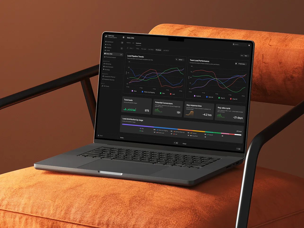
Northstar — Sales CRM Redesign
Project Overview
Northstar’s existing Sales CRM was vibe-coded to get the product running quickly, but as the sales operation grew, the experience no longer matched the team’s actual needs.
Sales managers struggled to understand setter and closer performance, track lead movement, and identify pipeline problems. Important information was buried among unnecessary fields, weak visual hierarchy, and fragmented workflows.
The redesign gave the CRM a new life — transforming it from a cluttered data-management tool into a focused sales workspace built around visibility, prioritization, and faster decision-making.
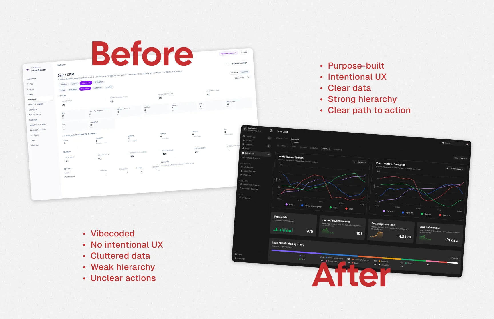
TL;DR
The old CRM worked, but it wasn’t designed around how the sales team actually operated.
I redesigned the experience by reducing information overload, restructuring the hierarchy, simplifying lead management, and making pipeline performance easier to understand at a glance.
The result was a clearer, faster, and more actionable CRM experience.
Understanding the Product
Product Purpose
What does it do?
- Provides an interface to manage leads and move them through different sales stages.
Why does it exist?
- To replace spreadsheet-heavy workflows with a cleaner and more manageable sales system.
What is its core value?
- Turns complex sales data into clear, at-a-glance insights that support faster decision-making.
Defining the Goals
Business Goal
Reduce sales reporting clutter by simplifying metrics, organizing data, and improving how information is distributed across the CRM.
User Goal
Help managers quickly understand lead stages, performance, and potential problems.
Product Goal
Create an organized view of the sales pipeline with clear, actionable insights.
Research
Research included:
- Stakeholder interviews
- Existing product analysis
- User feedback
The research helped identify which information actually mattered, what users were repeatedly searching for, and where the existing CRM was creating unnecessary friction.
Key Findings
01 — Information Overload
Users were presented with too much information at the same time.
02 — Poor Hierarchy
Important KPIs competed visually with secondary information.
03 — Difficult Pipeline Tracking
Users could not quickly identify where leads were getting stuck.
04 — Too Many Actions
Frequent actions were buried inside individual lead views, adding unnecessary steps.
Based on the research, the CRM was restructured around the way sales teams actually work:
Understand performance → Manage opportunities → Take action → Track changes
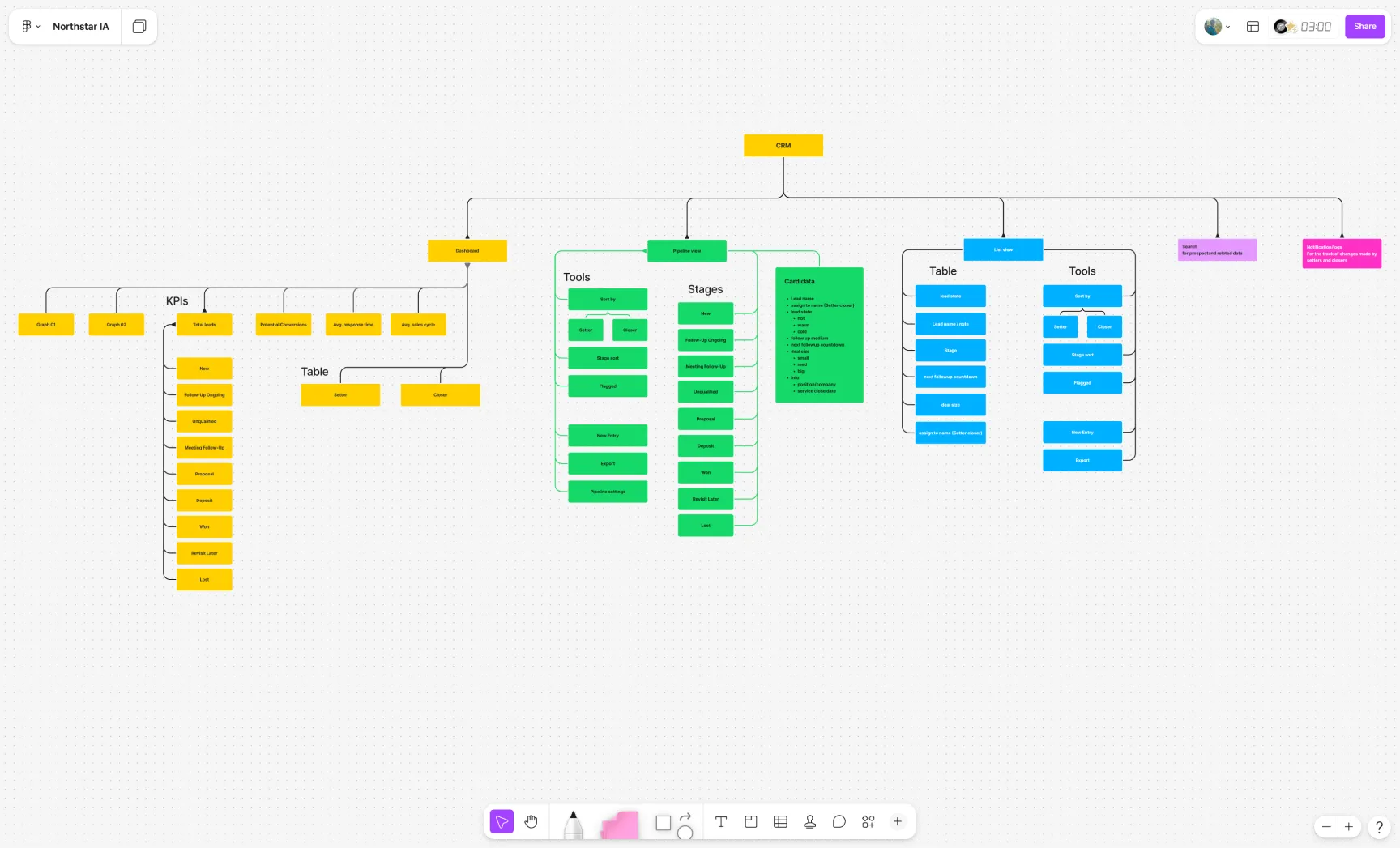
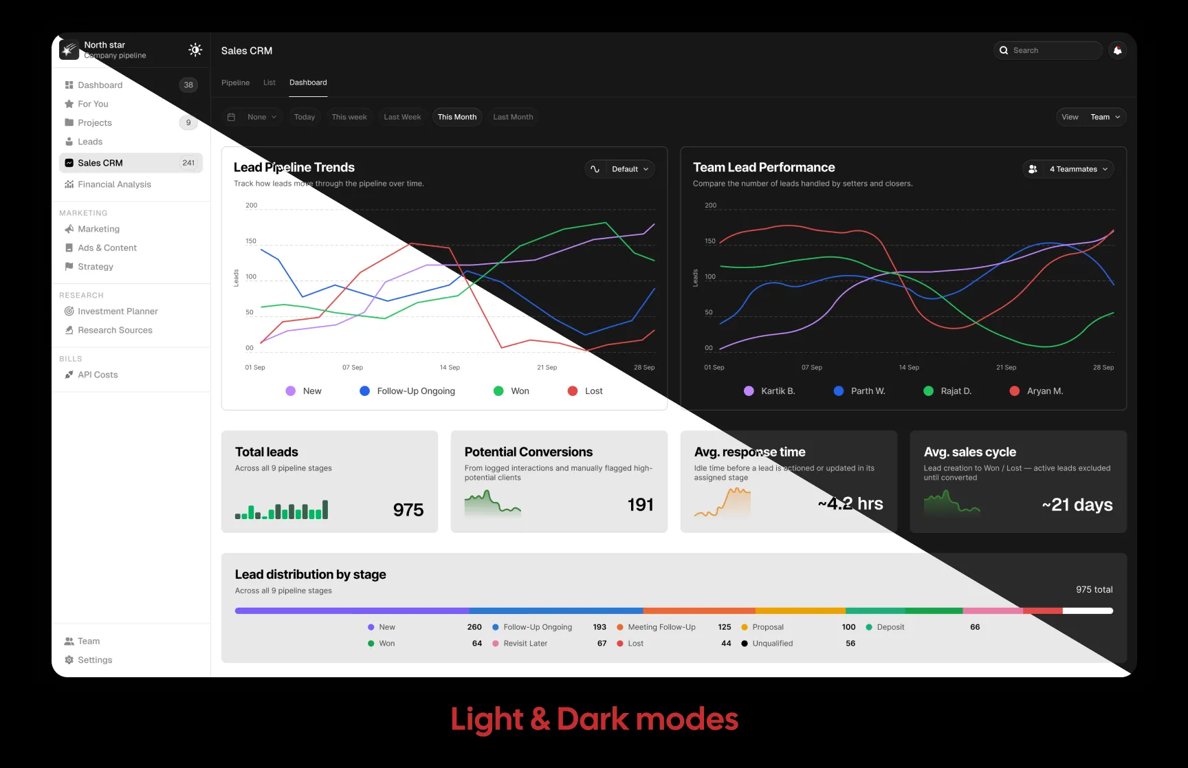
1. Dashboard — Understand the Bigger Picture
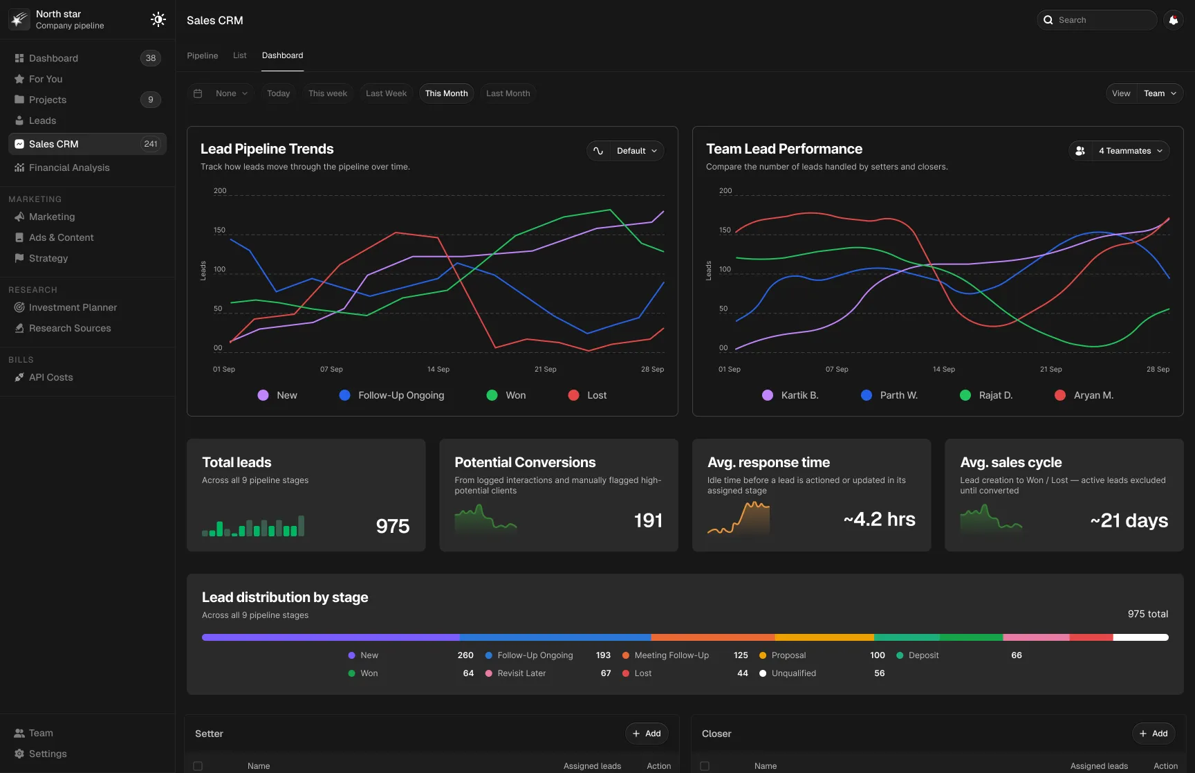
The Dashboard acts as the entry point, giving managers a high-level understanding of the sales pipeline before they move into individual leads.
KPIs, graphs, and summary tables surface key information such as:
- Leads
- Conversions
- Response time
- Sales cycle
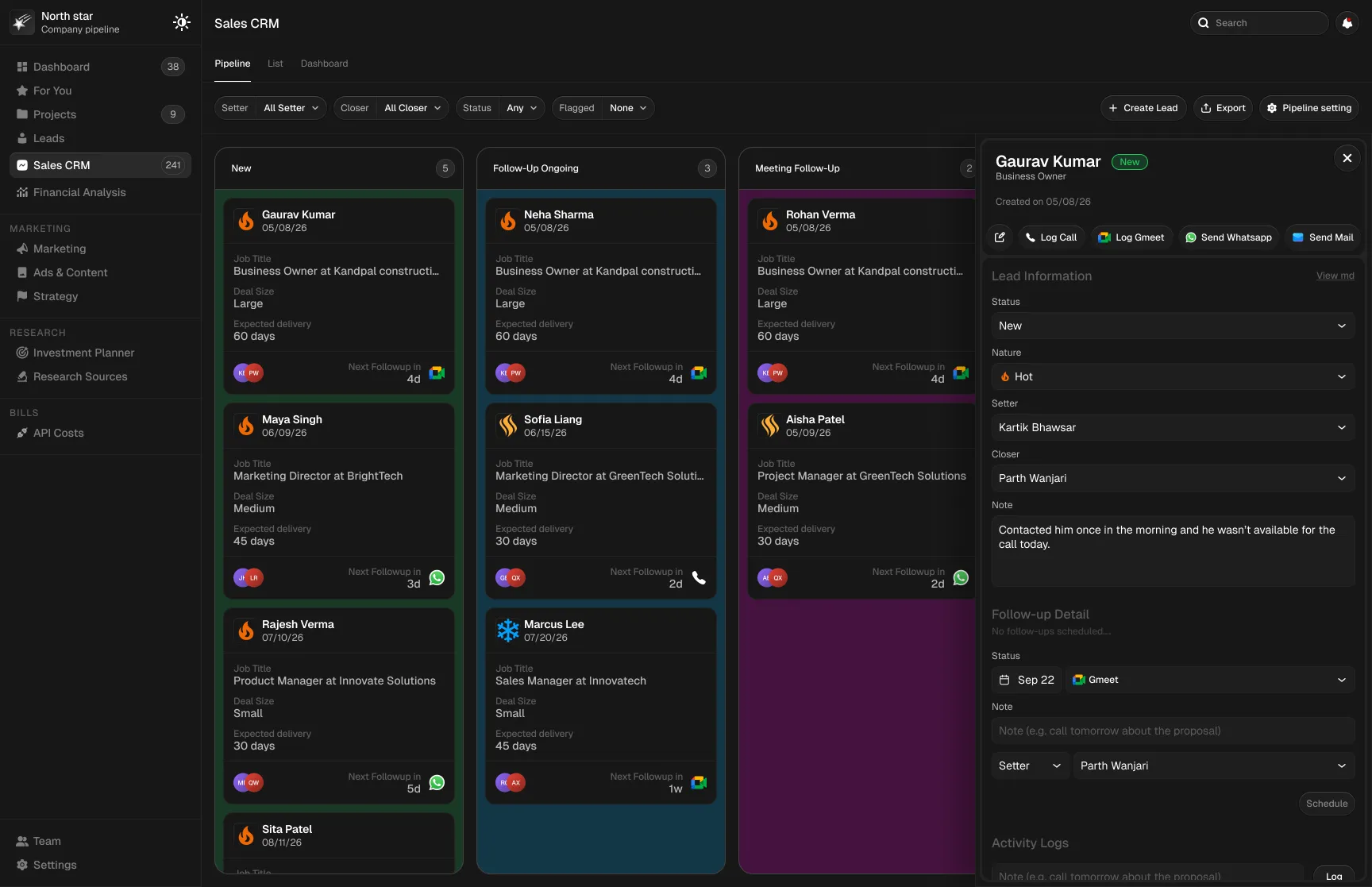
2. Pipeline View — Manage Leads Visually
The Pipeline View became the primary working area.
Leads are grouped by their current sales stage, allowing setters and closers to quickly understand where each opportunity stands and move it through the process.
Each lead card contains only the information required to make a quick decision:
- Lead name
- Owner
- Lead state
- Follow-up information
- Deal size
- Company/service information
This keeps the interface scannable without forcing users to open every lead.
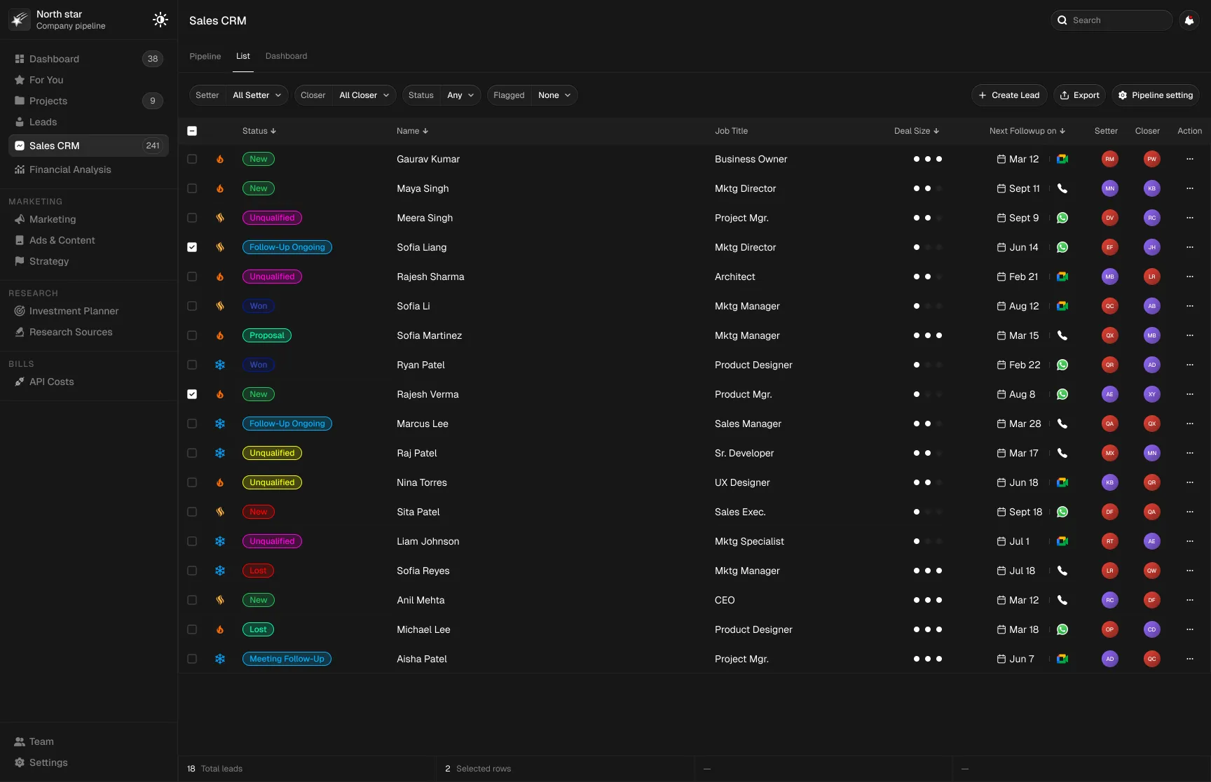
4. List View — Support Detailed Management
The List View provides a structured alternative for users who need to scan, compare, sort, and manage larger sets of lead data.
Search enables users to quickly locate specific leads and information across pipelines and tables.
6. Notifications — Stay Aware of Changes
Notifications help managers track important updates and actions made by setters and closers.
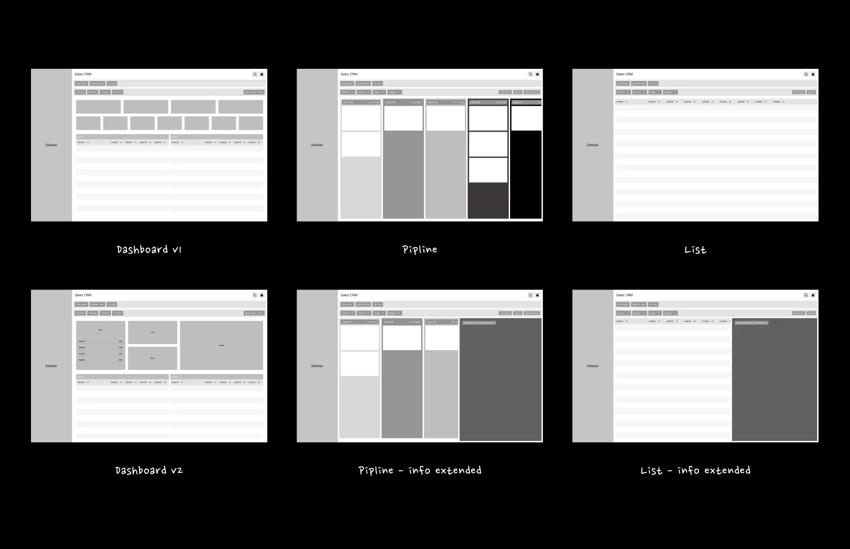
Wireframes
The new information architecture was translated into low-fidelity wireframes to validate hierarchy, navigation, and core workflows before moving into visual design.
Design Decisions
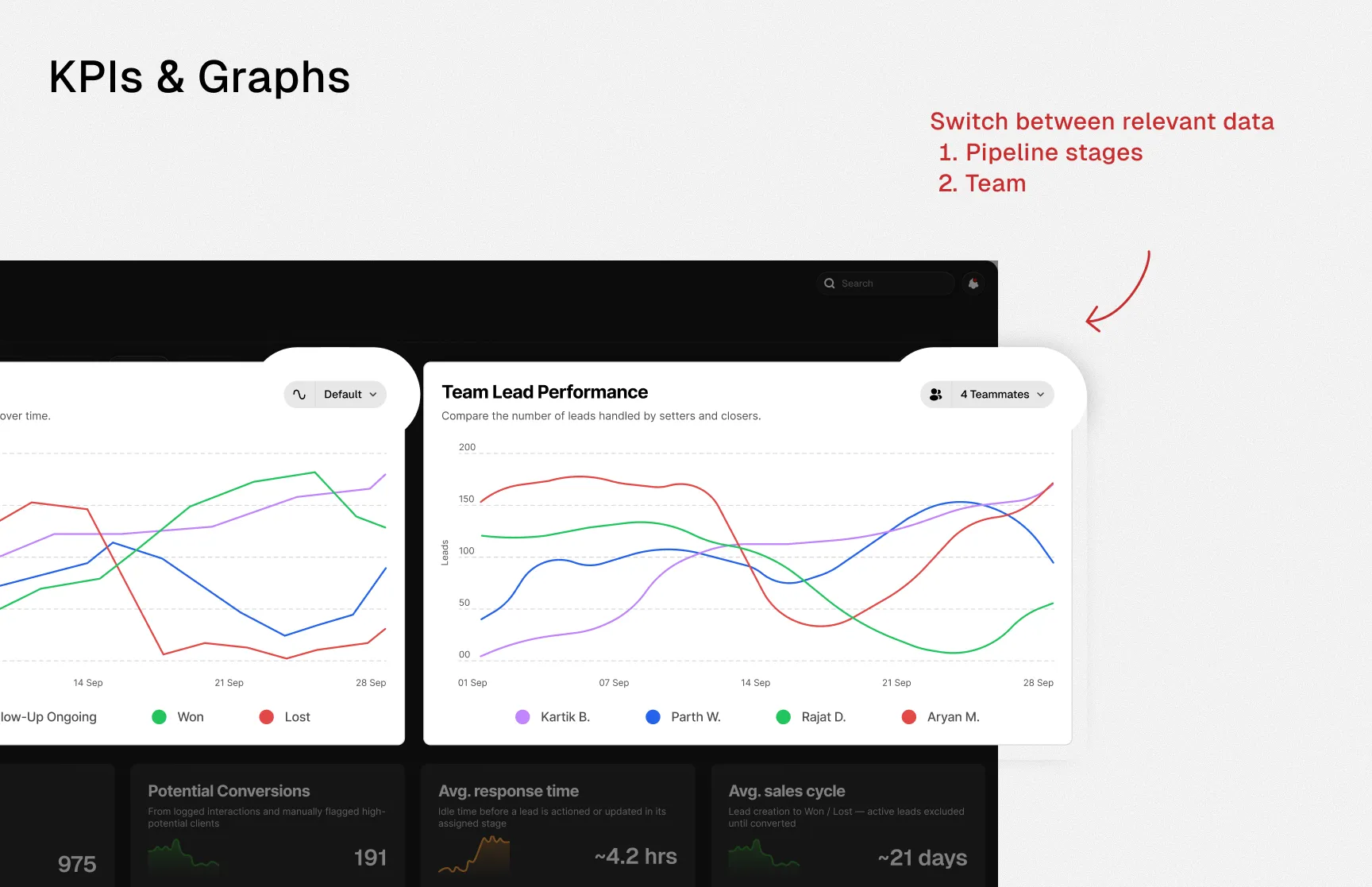
01 — KPIs & Graphs
Problem
The existing KPIs and graphs could not effectively represent the dynamic information managers needed at a glance.
Decision
- Introduced graph filters so users could switch between relevant data views.
- Added small historical visualizations to KPI cards to provide context around performance changes.
Result
Managers could understand both current performance and broader trends without navigating deeper into the CRM.
02 — Lead Priority
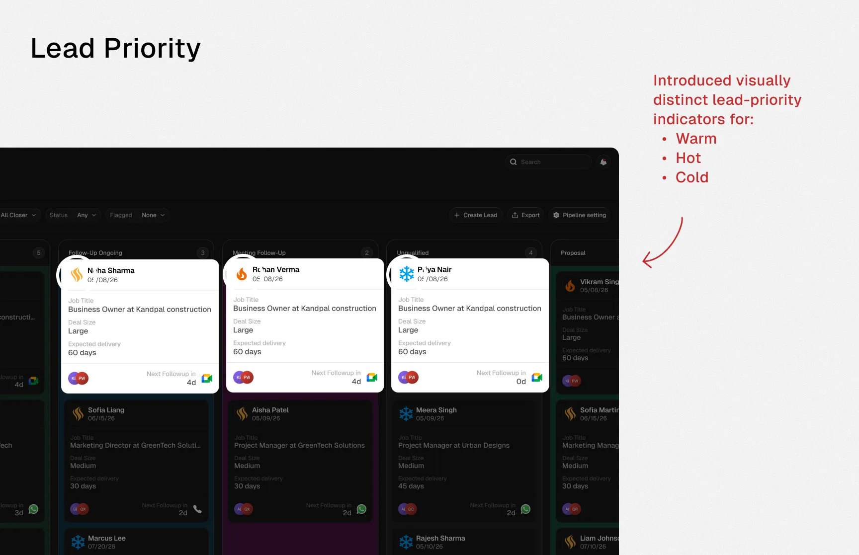
Problem
Setters and closers had difficulty identifying which leads required immediate follow-up.
Decision
Introduced visually distinct lead-priority indicators for:
Result
Users could prioritize follow-ups directly from the pipeline without searching through detailed lead information.
Visual Design
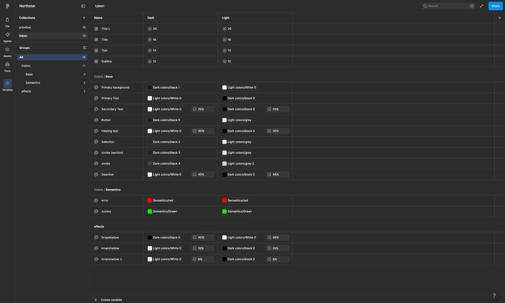
A scalable design system was created covering:
- Colors
- Typography
- Components
- States
- Spacing
The system was structured to support both light and dark modes without requiring every screen to be manually redesigned for each theme.
Final Solution
The redesigned CRM brought performance monitoring, pipeline management, lead prioritization, and everyday sales actions into one clearer and more structured experience.
Instead of simply displaying data, the new interface helps teams understand what is happening, where attention is required, and what action should happen next.
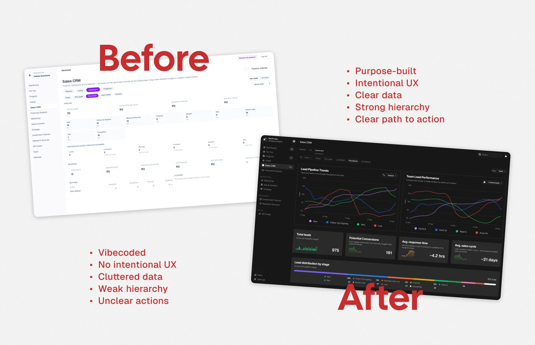
Before vs After
| Before | After |
|---|
| Cluttered information | Clear information hierarchy |
| Difficult KPI scanning | Prioritized KPIs with context |
| Complex navigation | Structured navigation |
| Hidden actions | Contextual actions |
| Difficult pipeline tracking | Clear visual sales pipeline |
| Hard-to-prioritize leads | Visible lead priority states |
Impact
~60%
Improvement in task efficiency
~40%
Reduction in navigation steps
3×
Faster KPI identification
Important sales metrics became easier to identify and scan.
Simplified Workflows
Common lead-management actions required fewer steps.
From Vibe-Coded to Purpose-Built
The redesign was not simply a visual refresh.
The original CRM proved the product concept, but it had been built quickly without a strong UX foundation. The redesign transformed that foundation into a purpose-built sales experience shaped around real workflows, clearer information, and faster decisions.

 Valnee