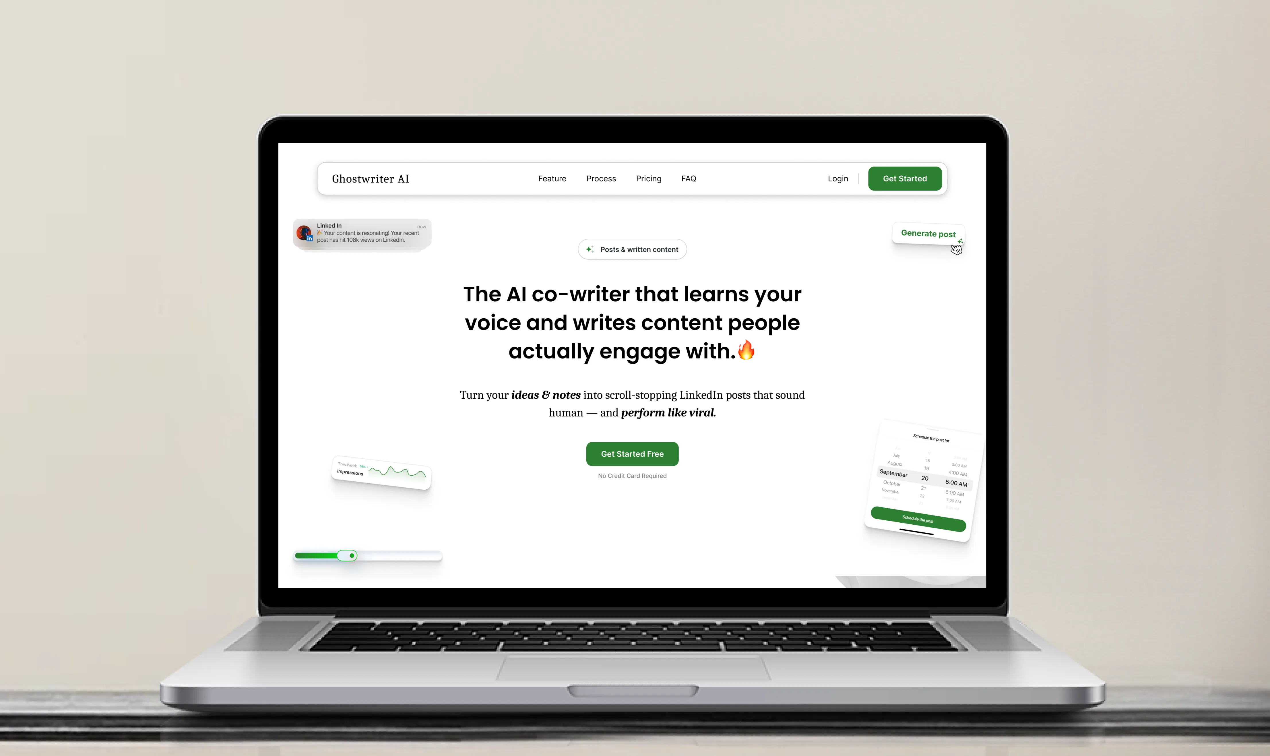
Ghostwriter — Designing a Human-First AI Landing Page
An editorial case study on designing a landing page that breaks the generic AI SaaS mold — using tactile typography, paper-and-ink contrast, and an unhurried reading rhythm to build trust with thoughtful creators.
01. The Strategic Brief
Every AI landing page today looks identical: dark mode saturated with purple-cyan neon gradients, abstract floating 3D spheres, and hollow copy shouting about "10x your output with 1-click magic".
For Ghostwriter, taking that route would have been fatal.
Ghostwriter isn't an automated content farm—it is a personal co-writer engineered to capture a creator’s real, nuanced voice for LinkedIn. The audience consists of founders, practitioners, and writers who care deeply about their credibility and actively dread sounding like ChatGPT.
The Landing Page Mission:
Design an experience that feels closer to an editorial literary publication than a software utility. Every section had to demonstrate that human ideas remain at the center, with AI operating quietly in the background as an invisible editorial partner.
02. Design Foundations: Decisions Behind the Aesthetic
A landing page cannot convey craft if its visual system feels arbitrary. We established a strict design token system rooted in editorial print principles.
Color Architecture: The "Ink on Paper" Philosophy
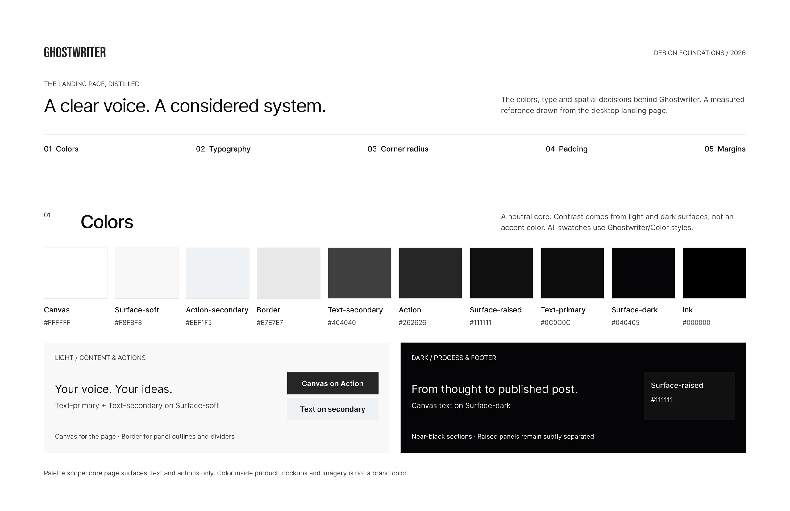
Most modern web products rely heavily on a vibrant accent color (electric blue, neon violet). We deliberately rejected that approach, building the landing page on a high-contrast monochromatic foundation:
- Canvas & Soft Light Surfaces (
#FFFFFF, #F8F8F8): Gives the page an open, airy feeling reminiscent of premium newsprint and literary journals.
- Surface Insets & Deep Contrast (
#111111, #040405, #000000): Darker sections are not pure digital black; they are dense, velvety tones that simulate rich printing ink.
- Intentional Color Moments: By stripping color from the page infrastructure, color is reserved exclusively for product highlights and organic warmth inside featured modules.
Typography with Narrative Intent
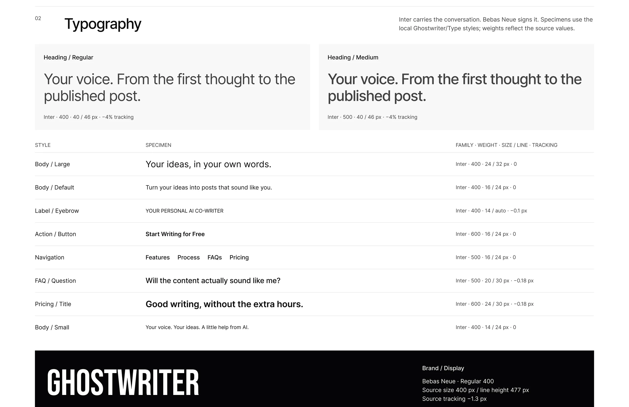
A landing page about writing must treat typography with reverence. We paired two contrasting typefaces with clear division of labor:
- Bebas Neue (The Architectural Masthead):
Historically inspired by bold print headlines and editorial covers. Set at monumental scale with tight negative tracking, Bebas Neue acts as the brand’s typographic signature. It gives the landing page weight, permanence, and dignity.
- Inter (The Unobtrusive Dialogue):
Used across all headings, body copy, and UI previews. Headings are set at 40px with a tight
-4% tracking to create an intimate, spoken-word cadence rather than a corporate billboard tone. In smaller body sizes, Inter recedes, allowing the visitor to digest arguments without typographic distraction.
Spatial Geometry & Reading Rhythm
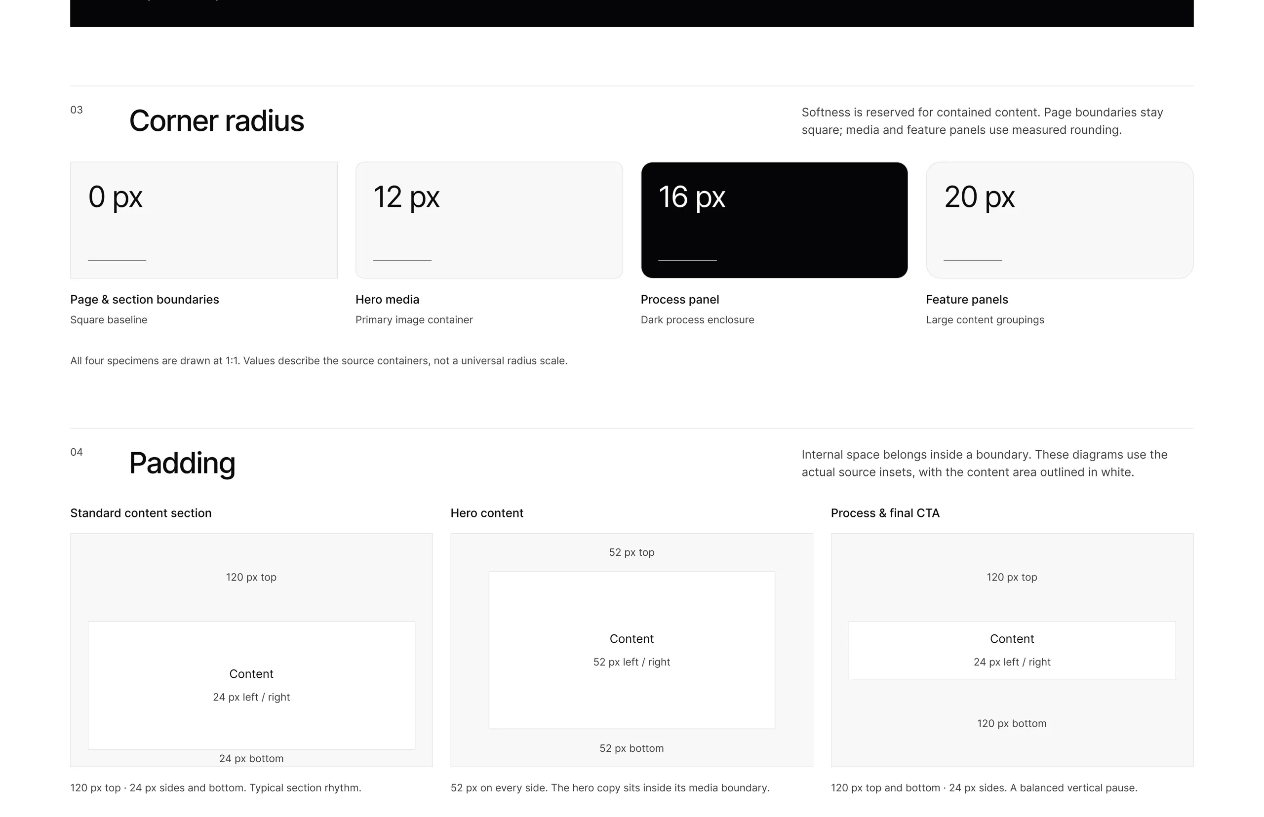
To keep the page grounded while making software previews feel approachable, we established two geometric tiers:
- 0px Structural Baseline: All page frames, section dividers, and grid outlines maintain sharp right angles. This creates an unyielding editorial structure across the viewport.
- Measured Radii (12px / 16px / 20px): Softness is reserved strictly for internal content enclosures—12px for media frames, 16px for process enclosures, and 20px for feature groupings.
- 120px Vertical Rhythm: Generous vertical breathing room between sections gives each concept space to land, enforcing an unhurried reading pace that mimics turning the pages of an essay.
Grid Architecture: The 1728px Canvas
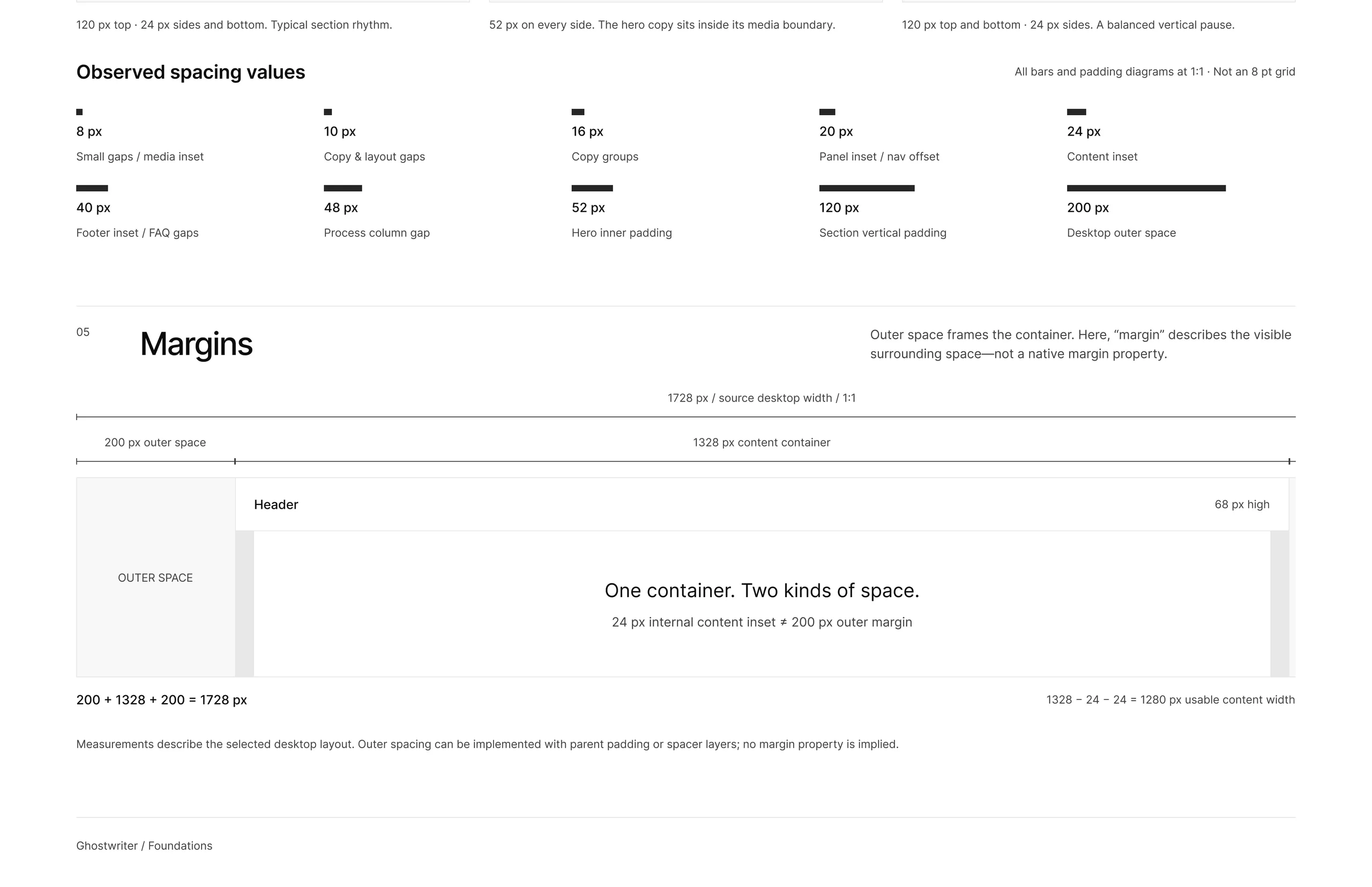
To support wide desktop viewports while preserving an intimate reading column, we established a strict ratio:
- 1728px Source Canvas: Framed by 200px outer margins that isolate the reading experience from browser edges.
- 1328px Content Container: Enclosing a 1280px usable content width with 24px internal insets, ensuring text lines never stretch into uncomfortable line lengths.
03. From Concept to Canvas: Getting Started in Figma
With our visual direction and tokens locked in, we moved into Figma to translate these concepts into a cohesive, production-ready landing page layout.
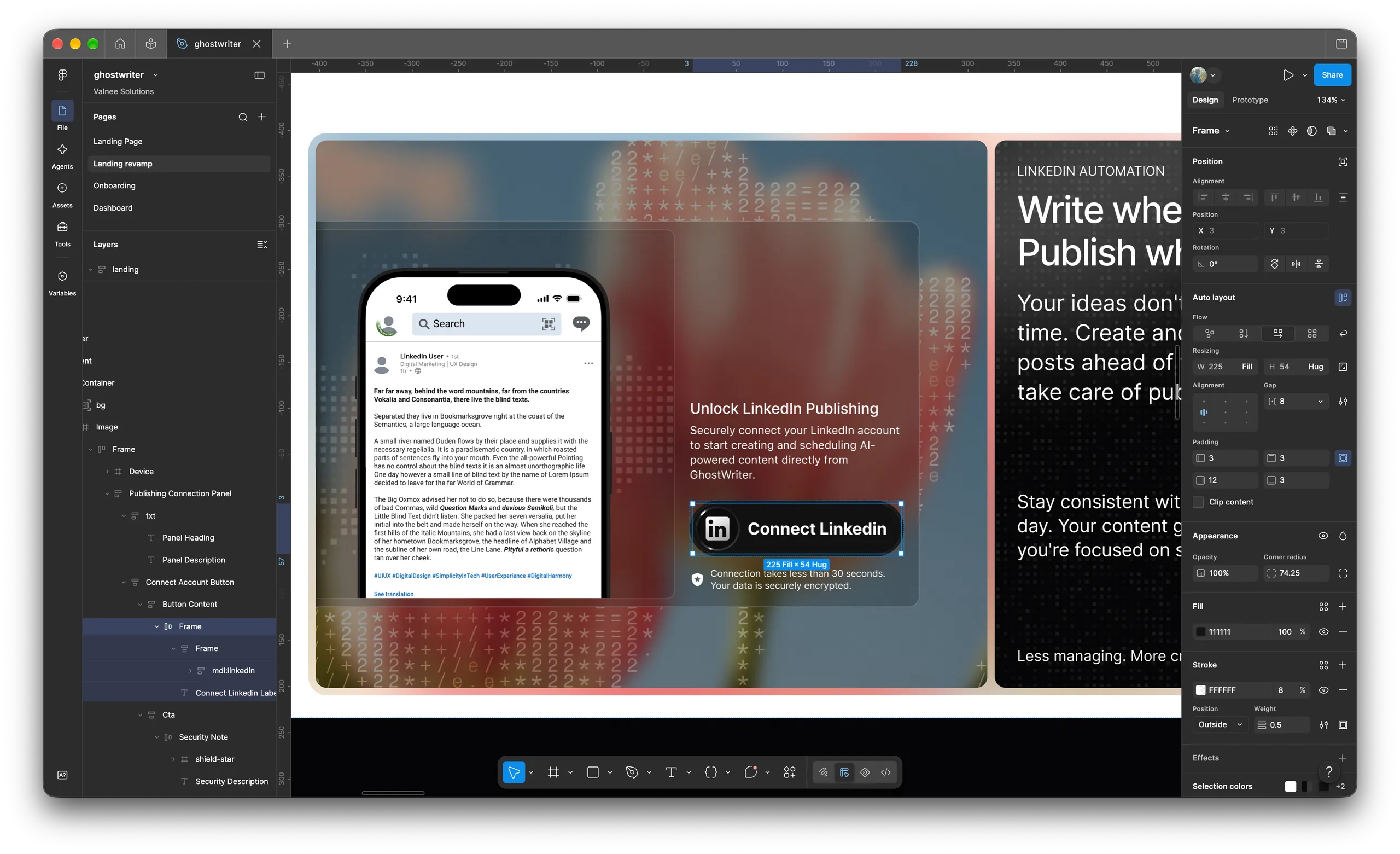
The Structural Blueprint
Before rendering final marketing cards, we structured the Figma canvas around modular auto-layout scaffolding:
- Componentized Insets & Strict Spacing: We locked all spacing to a tokenized scale (
8px, 16px, 20px, 24px, 52px, 120px), allowing rapid experimentation with section hierarchy without breaking visual rhythm.
- Prototyping Real In-Situ UI States: Instead of decorating the page with generic abstract placeholders, we built live, realistic interface states (like the LinkedIn distribution card and inline rephrase tooltips) directly into the layout. This ensured marketing promises matched the tactile reality of the app.
- Iterating the Landing Revamp: Layer groups were decoupled into standalone editorial sections—letting us stress-test how dark-mode modules (the interactive process and hero CTA) would contrast against the lighter canvas sections.
Now, let's look at how this architecture unfolds for the visitor.
04. Landing Page Breakdown: The Conversion Journey
The final page unfolds as a deliberate psychological progression: establishing human warmth, demonstrating immediate proof, dismantling user skepticism, and enabling effortless distribution.
01 · The Hero: Subverting Category Expectations
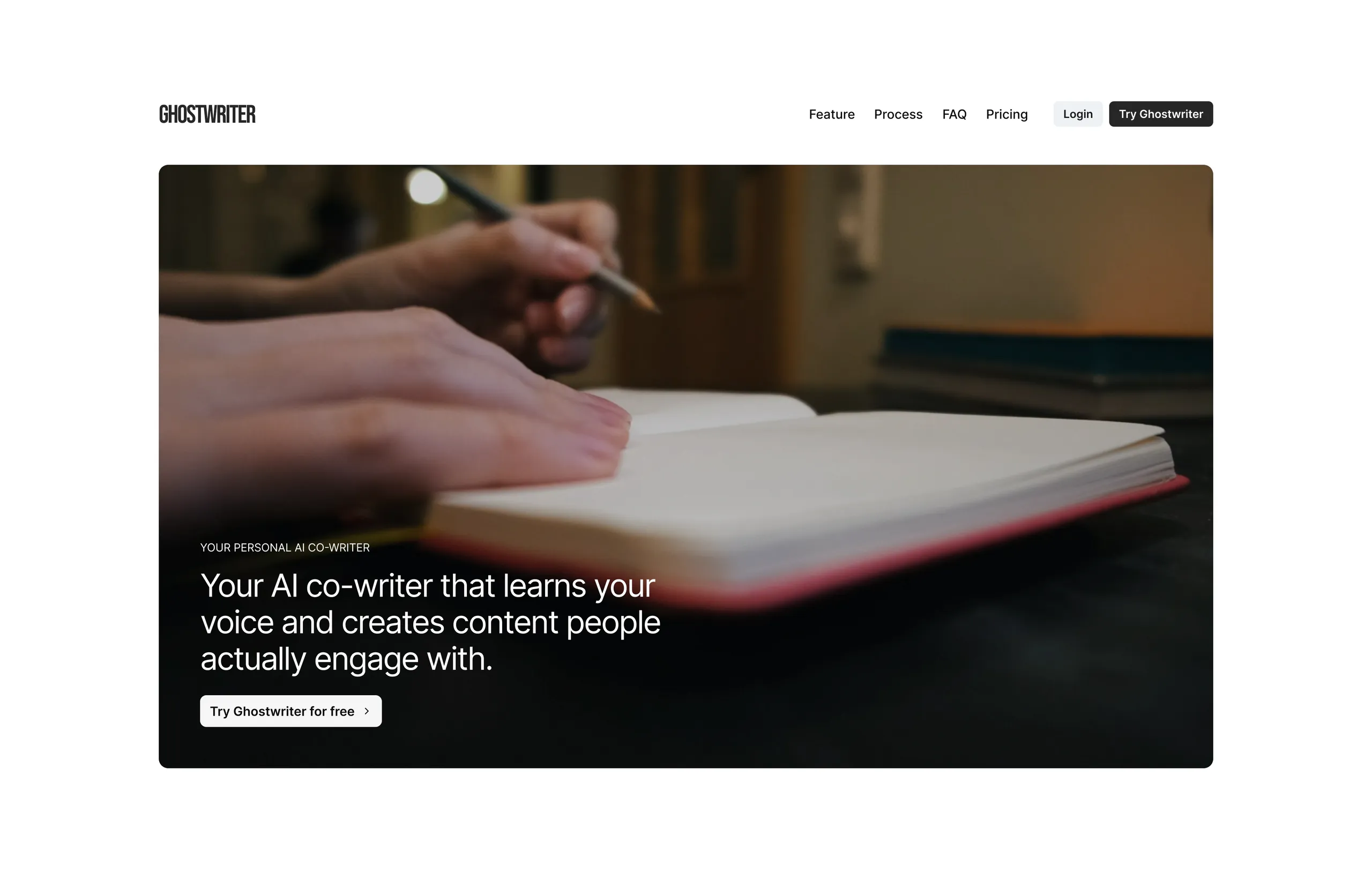
Instead of leading with a software dashboard or 3D graphic, the hero opens with warm, tactile analog photography—a hand holding a pencil over a journal.
- The Emotional Hook: Writing is deeply personal. By highlighting physical paper and pencil, the page reassures visitors that Ghostwriter respects human thought rather than automating it away.
- Core Value Statement: "Your AI co-writer that learns your voice and creates content people actually engage with."
- Frictionless Entry: A focused headline, restrained pill CTA, and uncluttered navigation keep the focus squarely on the message.
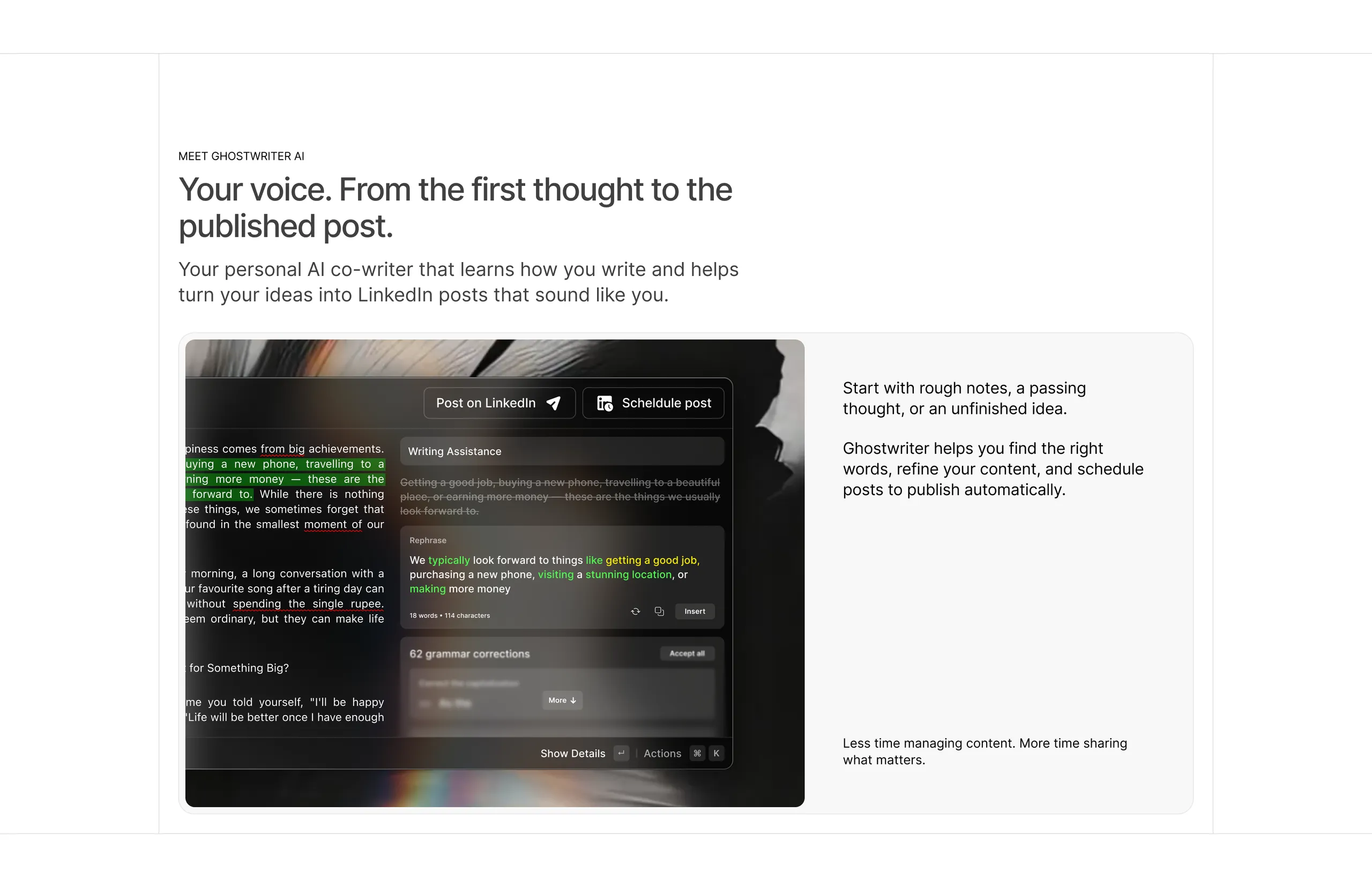
Visitors don't trust empty AI promises without immediate visual evidence. Directly below the fold, we bring the writing environment into focus:
- Shows live inline grammar corrections, rephrasing suggestions, and keyboard action palettes.
- Proves the core workflow: transforming raw, fragmented thoughts into structured LinkedIn content.
- Copy reinforces mental ease: "Start with rough notes, a passing thought, or an unfinished idea... Less time managing content. More time sharing what matters."
03 · Dismantling the Core Objection (The Feature Trinity)
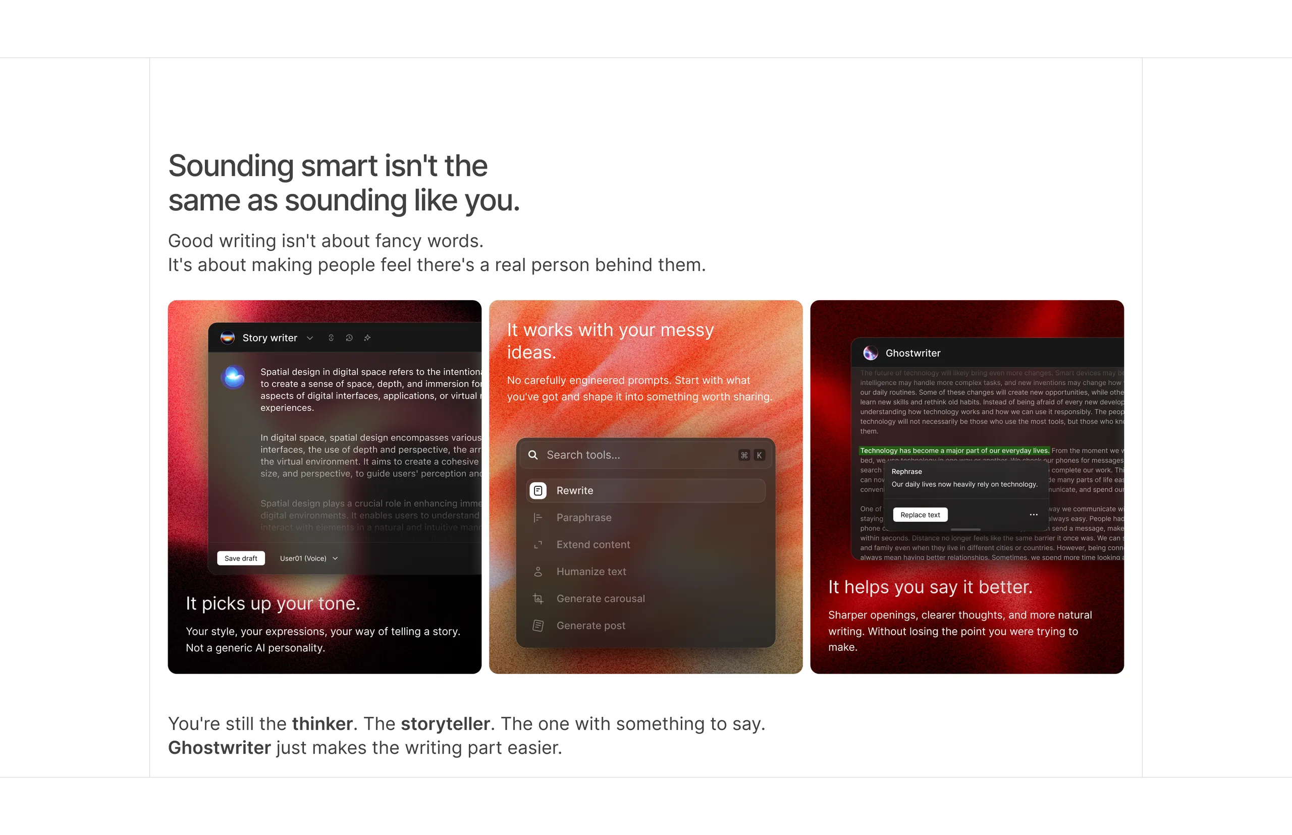
The primary reason creators hesitate to use AI is the fear of sounding robotic or phony. This section tackles that skepticism head-on:
"Sounding smart isn't the same as sounding like you. Good writing isn't about fancy words. It's about making people feel there's a real person behind them."
Three warm, textured cards break down the technical differentiation into creator-friendly benefits:
- Picks up your tone: Adapts to individual sentence flow and vocabulary.
- Works with messy ideas: No prompt engineering required—start with raw bullets.
- Helps you say it better: Refines clarity and hooks without stripping personality.
Sun-warmed organic grain textures behind dark UI components bridge natural warmth with modern software craft.
04 · The Distribution Bridge (Native LinkedIn Publishing)
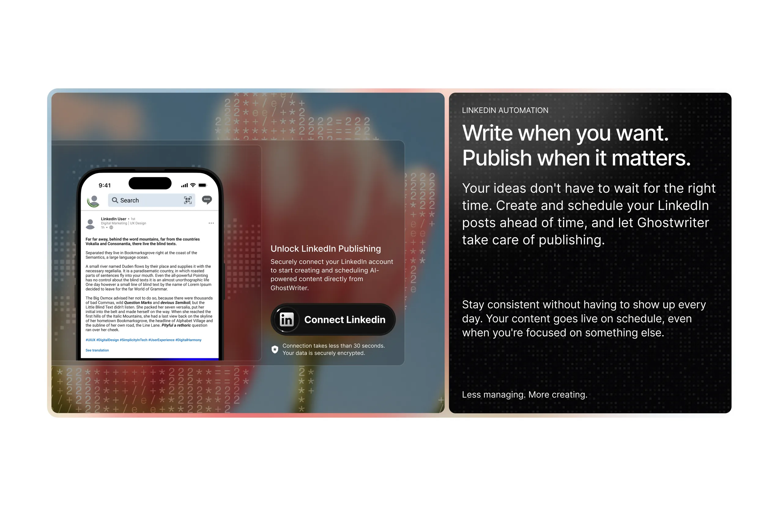
Writing great content is only half the battle; consistent publishing is where creators stumble. This section bridges creation directly to distribution:
- Pairs a realistic mobile LinkedIn feed preview with an instant 30-second OAuth connection card.
- Alleviates technical anxiety with prominent security reassurances ("Connection takes less than 30 seconds. Your data is securely encrypted.").
- Delivers the core operational takeaway: write whenever inspiration strikes, and let the scheduler handle consistent timing.
05 · Demystifying the Engine (The Humanizer Process)
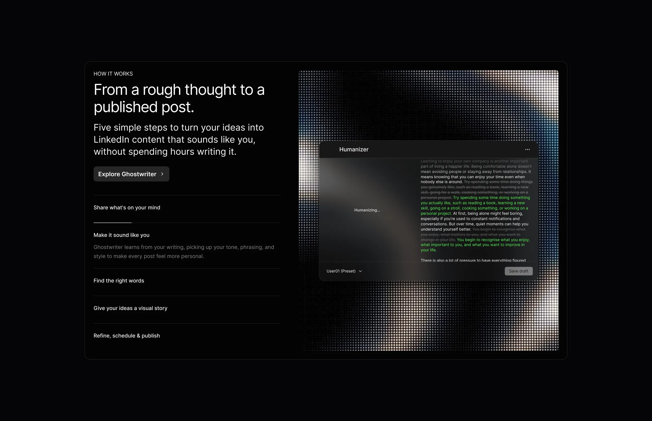
Rather than a generic static diagram, this section features an interactive walkthrough pairing a 5-step stepper on the left with an active preview on the right.
The active state highlights the "Humanizer":
- Shows real-time analysis where stiff, formulaic AI phrasing is actively stripped out and replaced with fluid, natural expressions.
- Demystifies the underlying mechanism, giving users full confidence that their final drafts will sound genuine.
06 · Transparent Conversion & Pricing
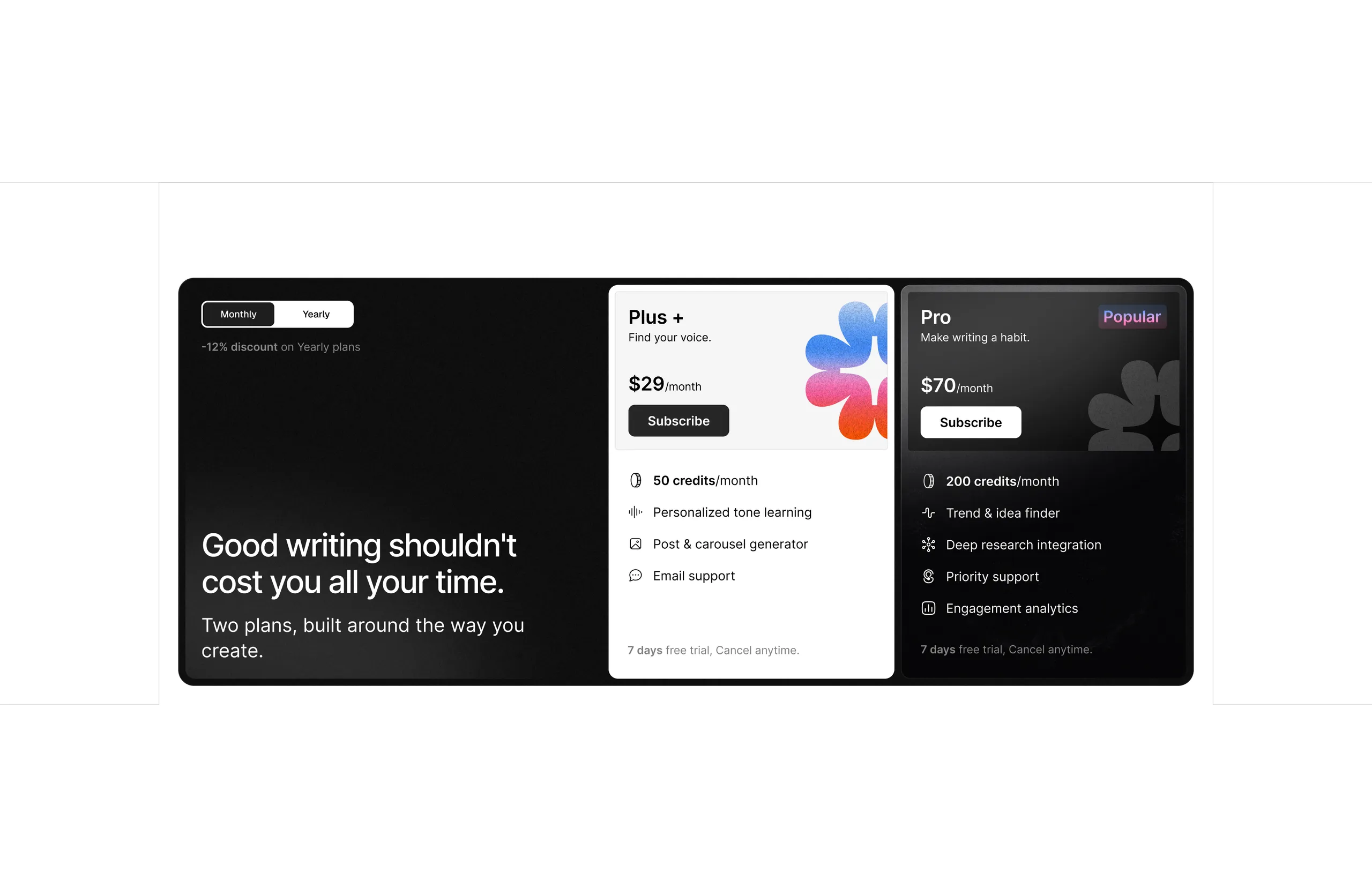
Pricing is structured to eliminate cognitive friction:
- Clean monthly/yearly toggle with a subtle
-12% incentive.
- Two focused tiers: Plus ($29/mo) for emerging individual voices, and Pro ($70/mo) for established creators needing deep trend research.
- High-trust reassurance: 7-day free trial, cancel anytime.
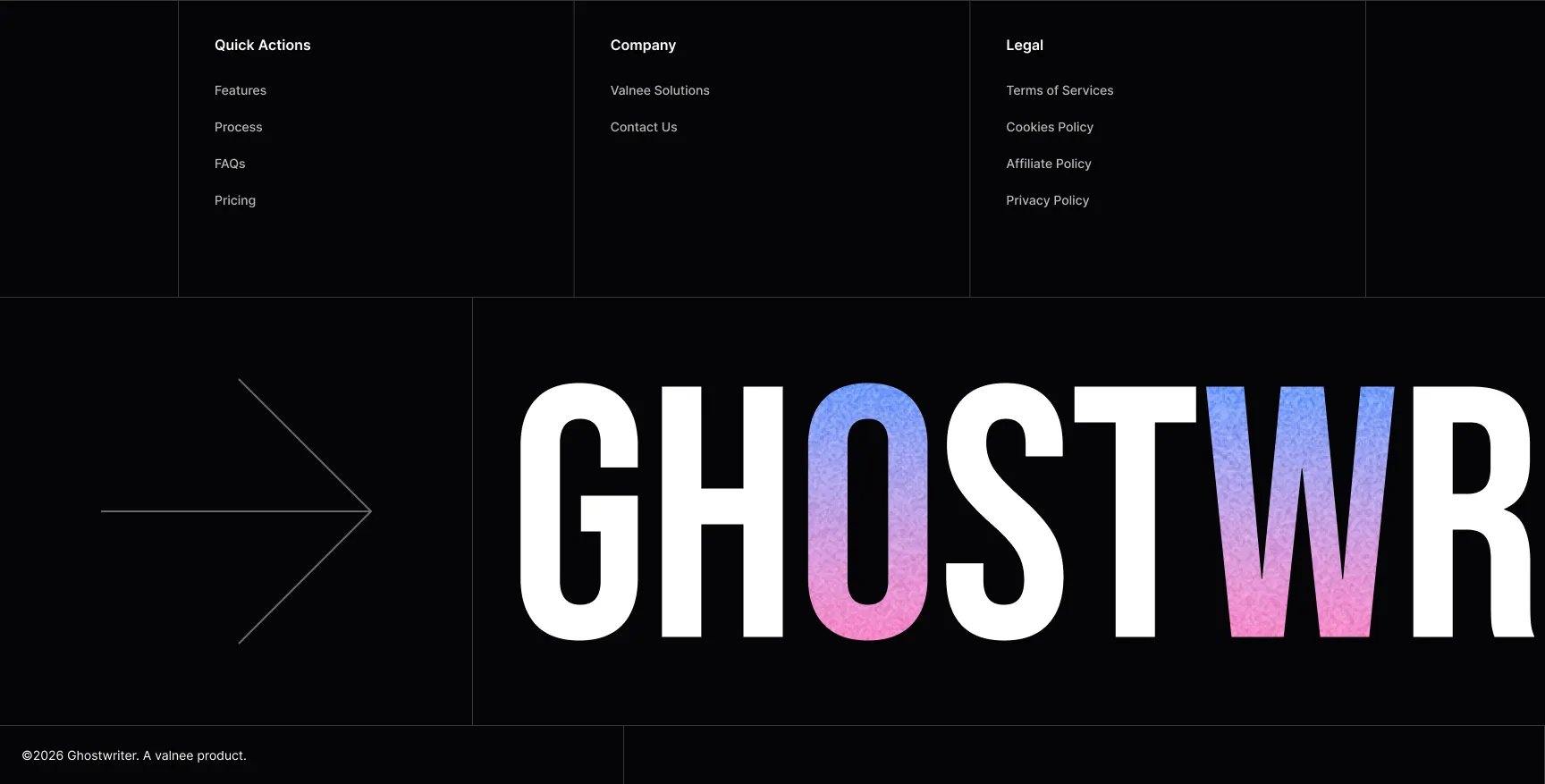
Most SaaS footers end with a whimper—a bland cluster of grey links.
Ghostwriter concludes with an architectural statement: an oversized display masthead (GHOSTWR) embedded with a textured gradient mesh, anchored by a disciplined 3-column navigation taxonomy (Quick Actions, Company, Legal). It leaves an unmistakable impression of craft as the visitor completes the page.
05. Summary of Outcomes
| Focus Area | Design Strategy | Impact |
|---|
| Visual Tone | Replaced neon SaaS gradients with analog photography & ink-on-paper contrast. | Set Ghostwriter apart from generic AI generators. |
| Typography | Paired monumental Bebas Neue with human-scaled Inter. | Delivered an authoritative, literary feel. |
| Figma Scaffolding | Structured layout with tokenized spacing and realistic in-situ UI components. | Enabled seamless iteration from concept to final sections. |
| Conversion Flow | Addressed skepticism immediately through live in-situ UI and the Humanizer walkthrough. | Built credibility and eliminated conversion hesitation. |

 Valnee